WanderWave - Adventure Seeker App
A travel app with flight and hotel booking features. Additionally, tours booking option and a community chat platform for travellers are also available.
CLIENT
Personal Project
PROJECT TYPE
App Design
ROLE
UX Designer
About the Project
Grid System
Color Palette
Typography
Screens
Poppins
An elegantly curated colour palette creates a harmonius visual identity, embodying the essence of simplicity, trust and innovations
This app aims to give travellers the experience of a lifetime with various activities and also simultaneosuly ensuring their safety. With variety of activities included in their itinerary,
WanderWave is an app that is made for adventure seekers to plan their upcoming thrilling escapade .

The design system will provide a
unified approach to UI elements, ensuring that the app’s appearance and behaviour remain consistent across different mobile platforms such as android and iOS devices.
Columns :- 4
Margin :- 16px
Gutter Space :- 20px
Column Width :- 72px
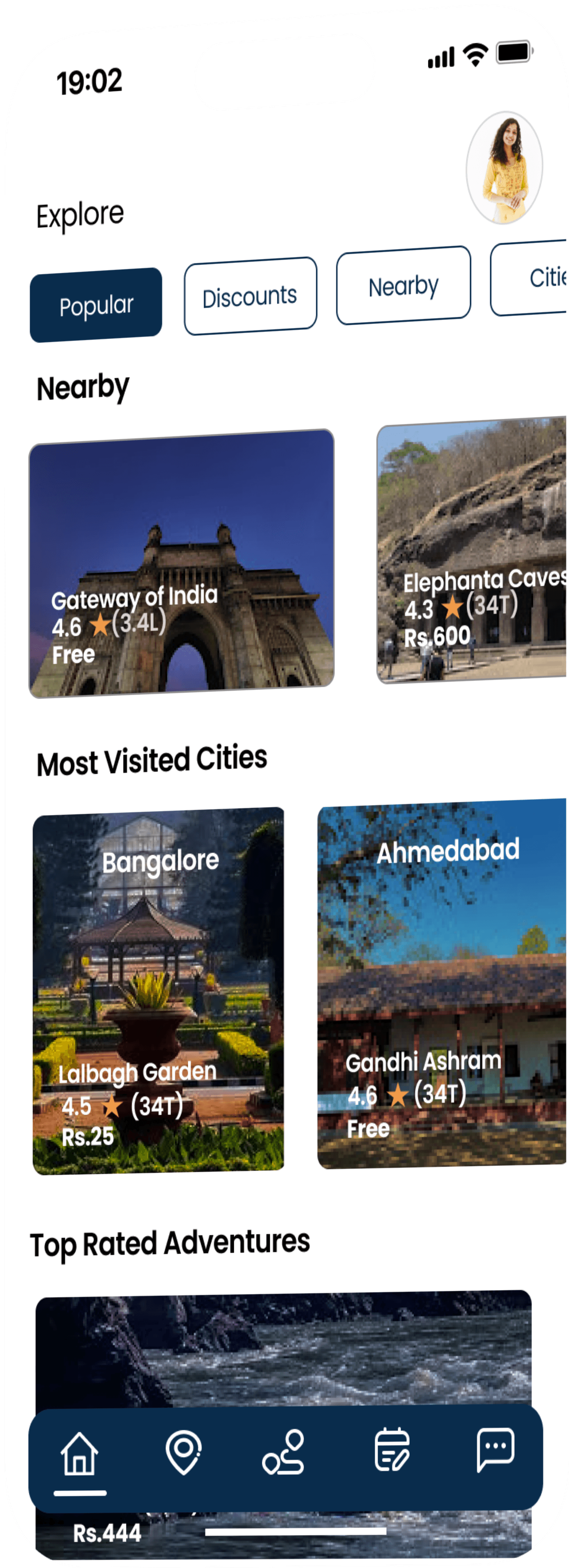
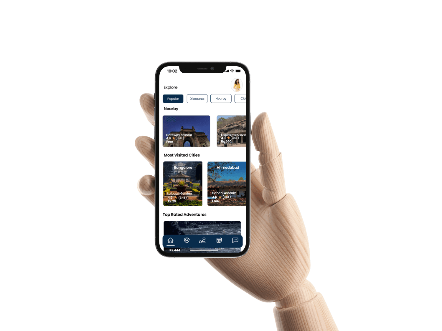
Most Visited Cities
Stars
Price
Stars
Price
Popular
Discounts
Nearby
Cities
Explore
Nearby
Lalbagh Garden
(34T)
4.5
Rs.25
Bangalore
Gandhi Ashram
Ahmedabad
4.6
(34T)
Free

Rs.250
Hyderabad
4.5
(2L)
Charminar

Rs.1,100
Agra
4.6
(2L)
Taj Mahal
Free
(3.4L)
4.6
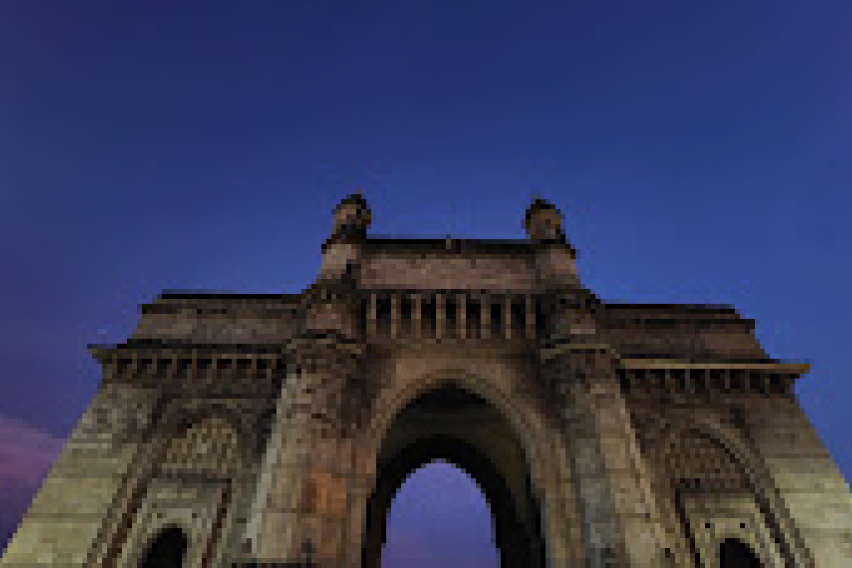
Gateway of India

(34T)
4.3
Rs.600
(59T)
4.3
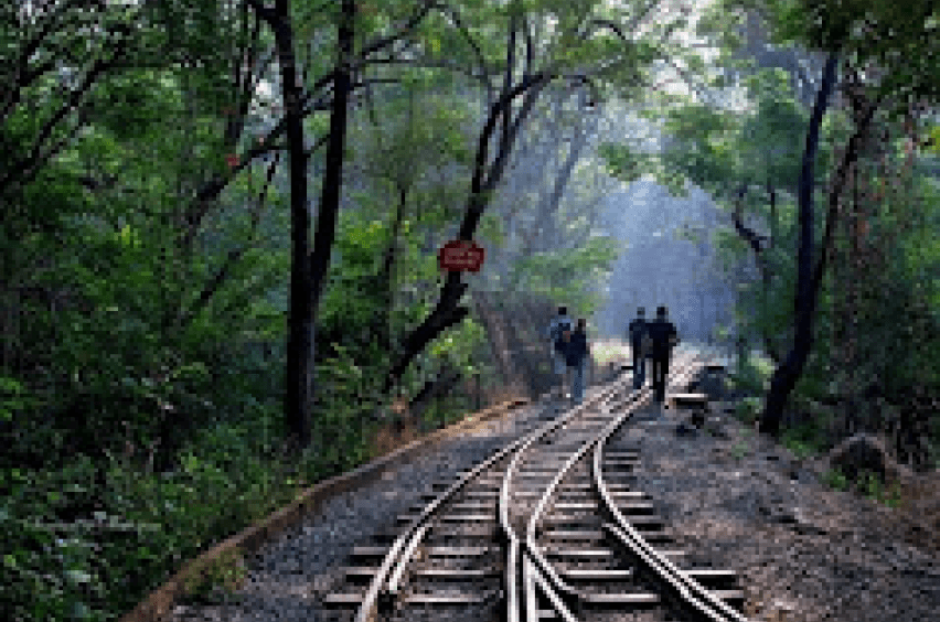
Sanjay Gandhi National Park
Rs.58
Free
(1.1T)
4.1
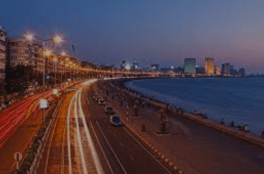
Marine Drive
Elephanta Caves
4.7
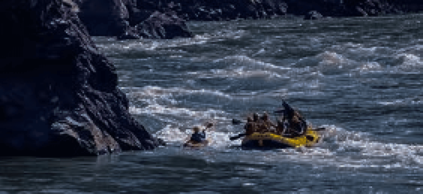
Rishikesh Rafting
(4,7T)
Rs.444
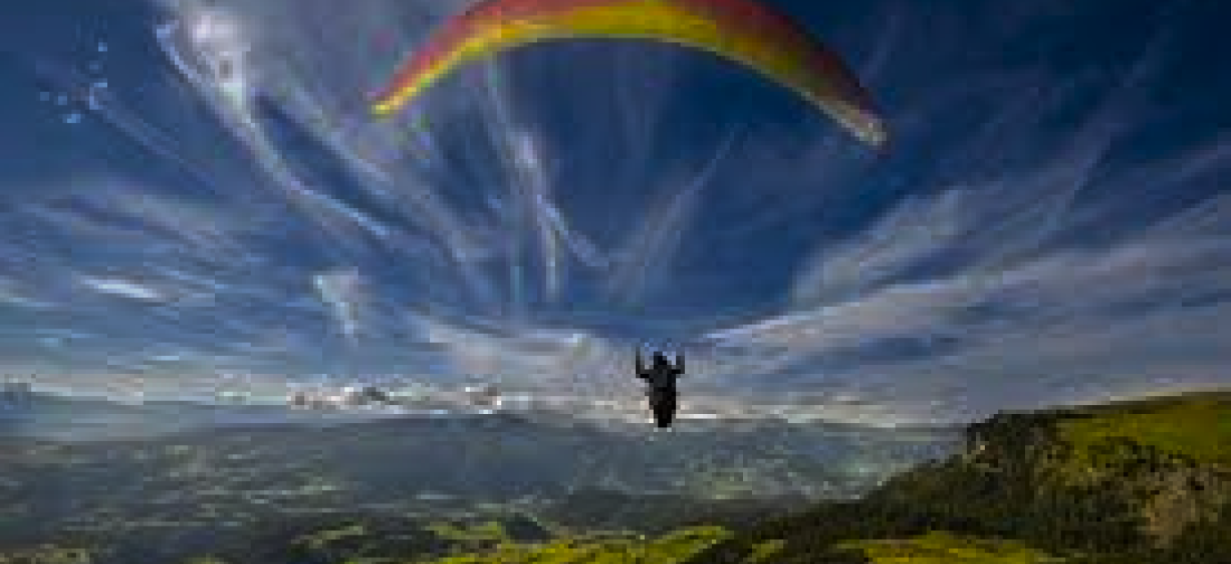
Paragliding Manali
4.6
Rs.1,700
(1T)

Surfing Kovalam
4.5
(2T)
Rs.3,300
Top Rated Adventures
19:02
#FFFF
Background Color
Primary Color
#092C4C
Secondary Color
Secondary Color
#8886FC
#F2994A
Choosing a typeface and a color set were two of the most important things. So, i created a simple typography scale to ensure that hierarchy throughout the project is preserved. I created a simple UI Style Guide to maintain consistency.
Aa
Body Text 3
Semi-Bold/Regular
14px
14px
Body Text 4
Semi-Bold/Regular
12px
10px
Name
Font Weight
Font Size
Heading 2
Bold
42px
52.8px
Heading 3
Bold
34px
44px
Heading 4
Bold
30px
35.2px
Heading 5
Semi-Bold/Regular
24px
26.4px
Body Text 1
Semi-Bold/Regular
18px
22px
Body Text 2
Semi-Bold/Regular
16px
18px
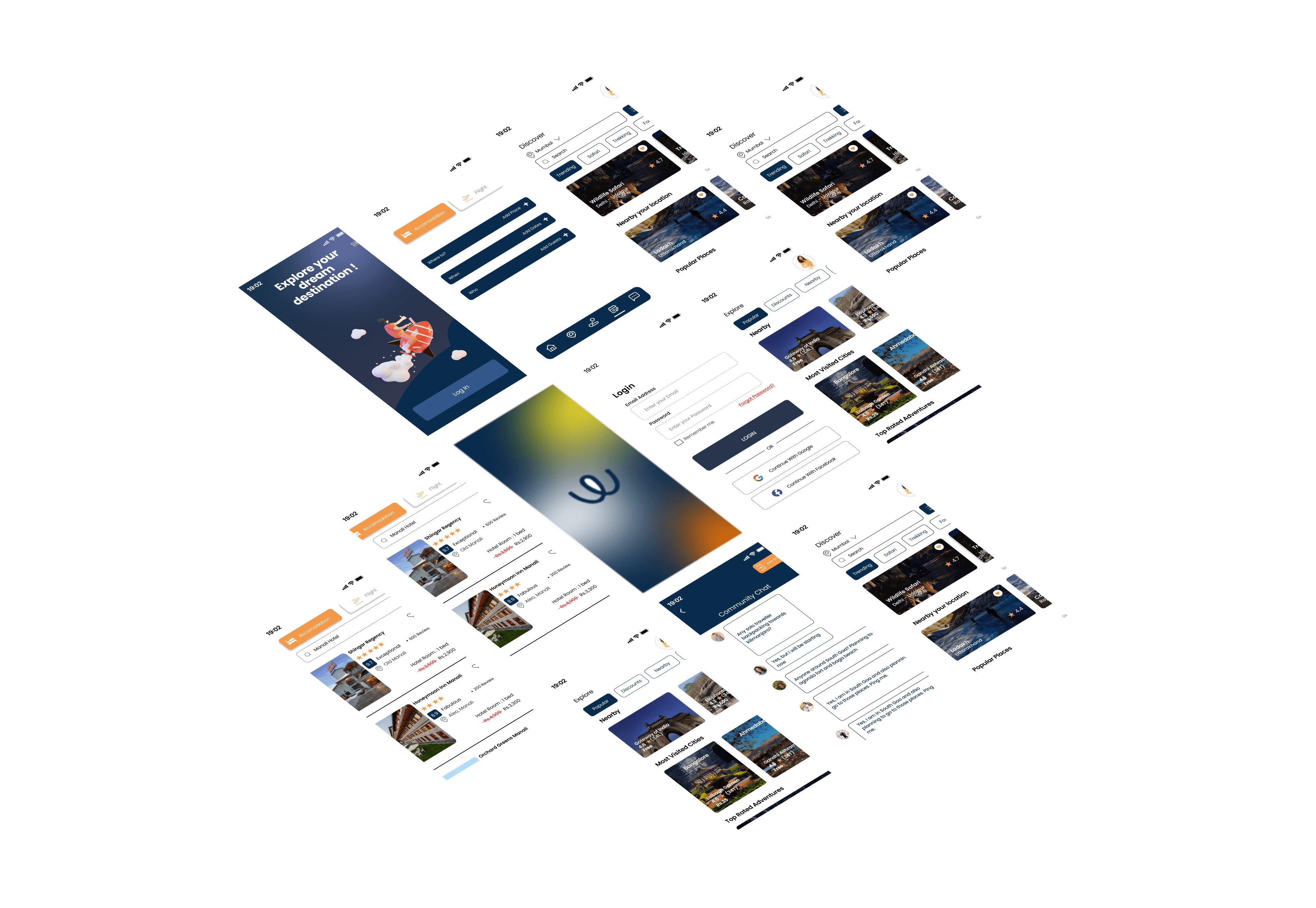
The thoughtfully designed screens of the WanderWave app converge functionality and aesthetics, providing users with intuitive and visually pleasing inteface that effortlessly guides them through their adventhurous journey.
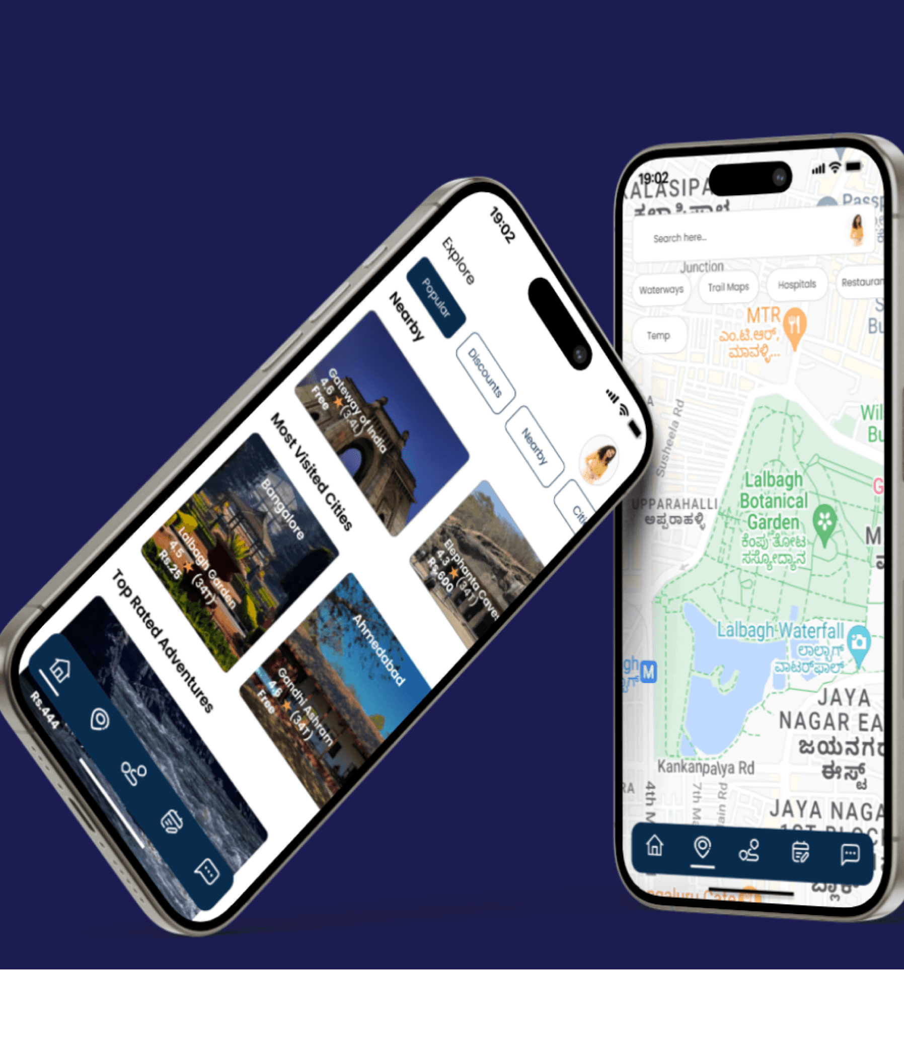
Home Screen
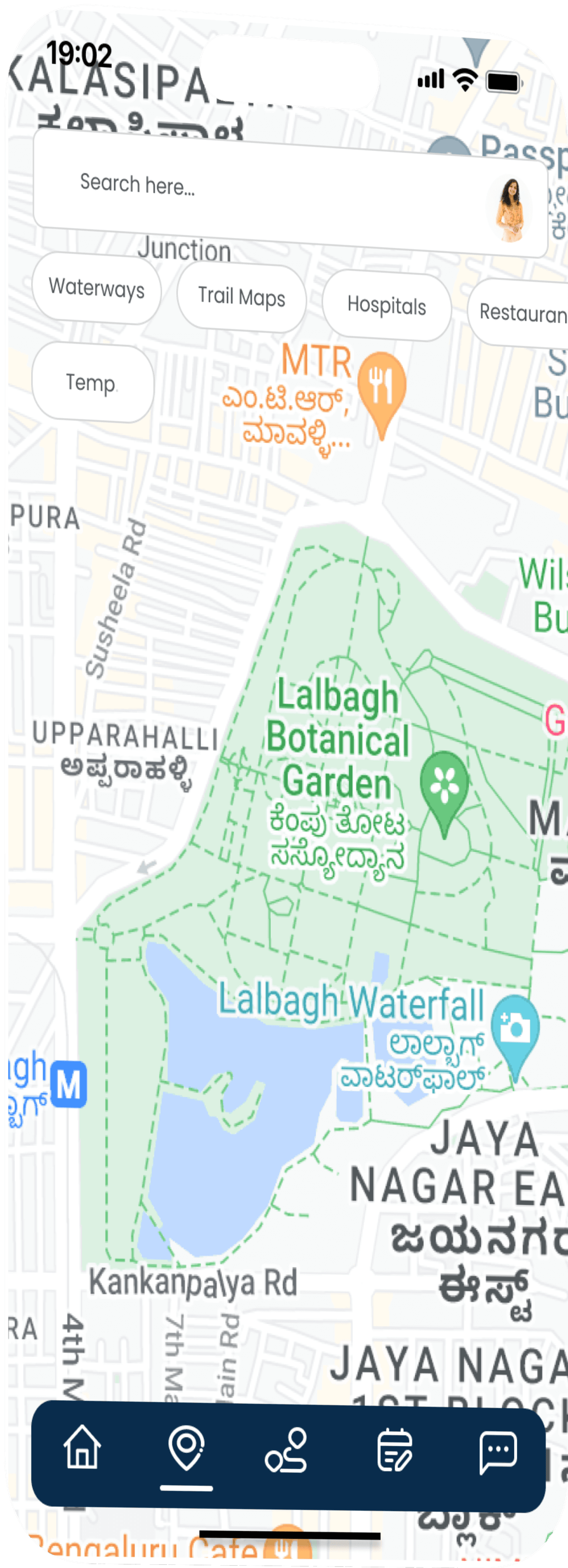
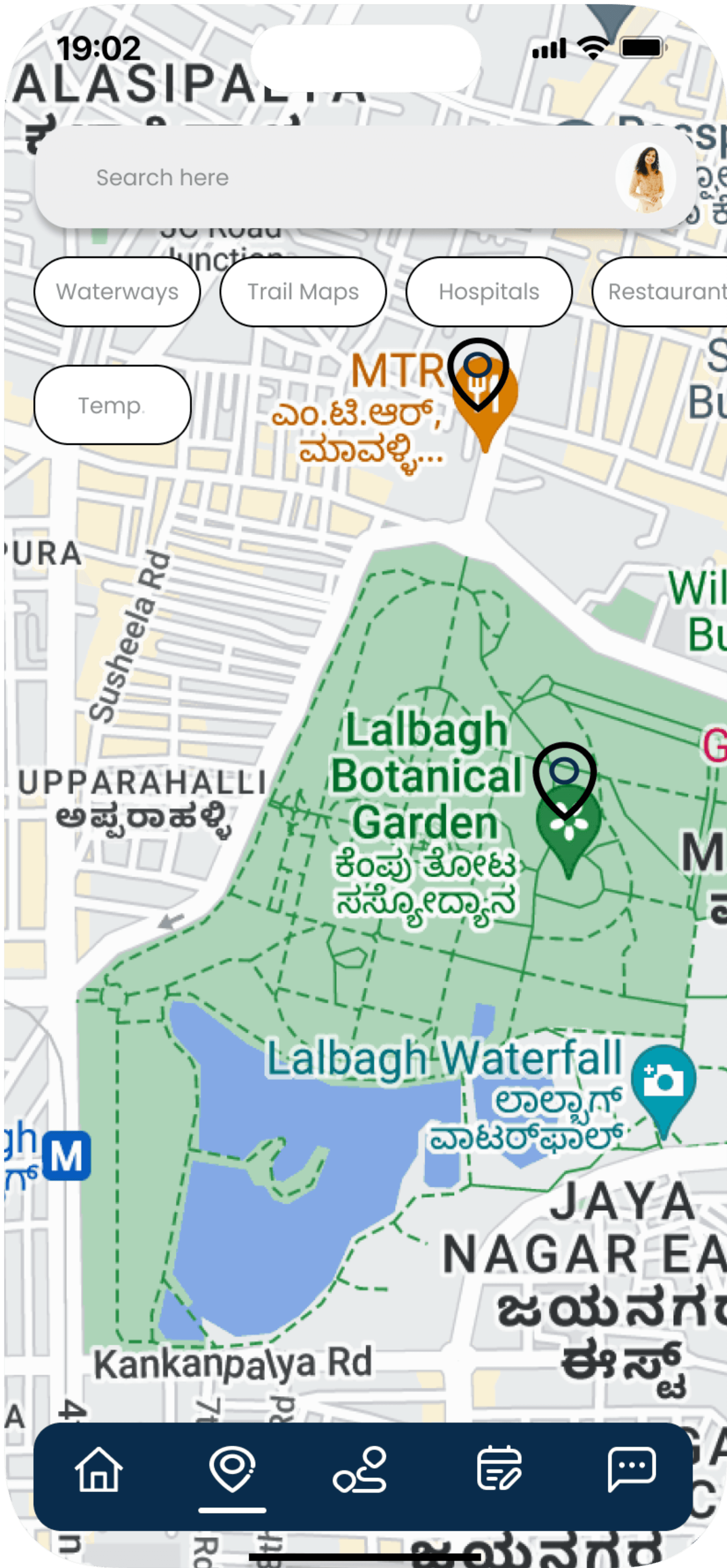
Offline Navigation Map Screen
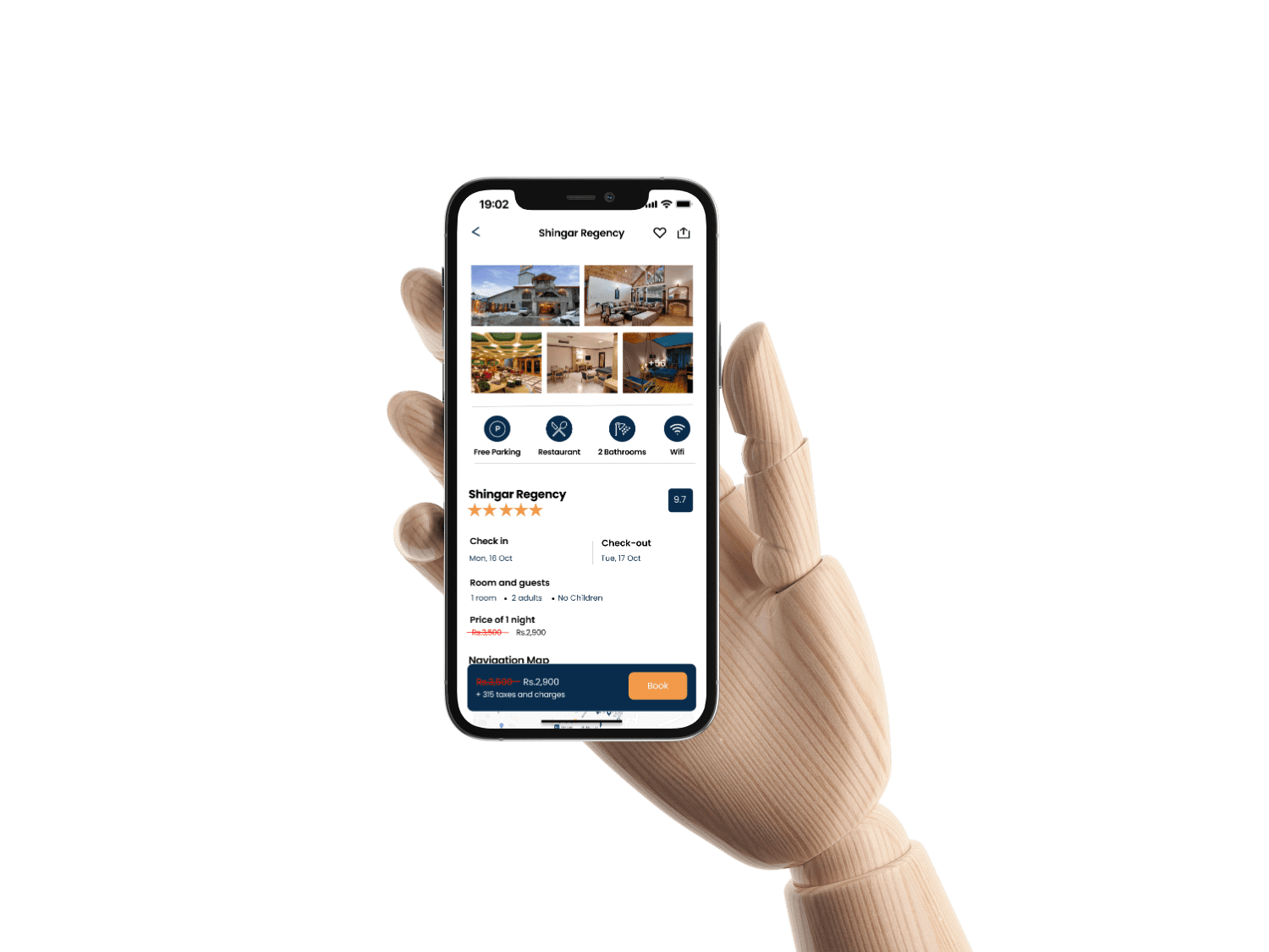
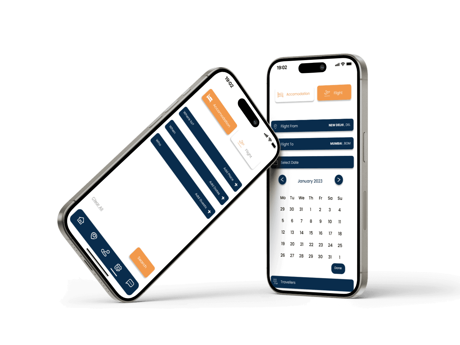
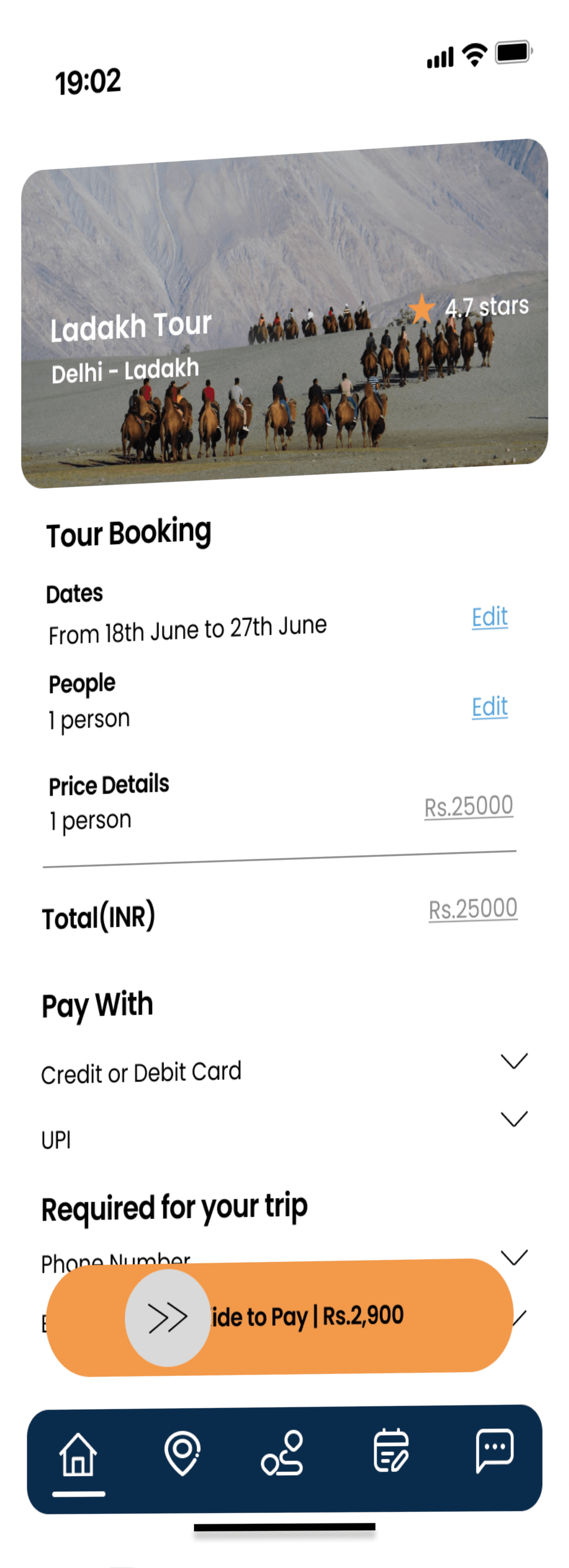
Booking Section
The ‘Accomodation’ sub-section provides the user to book hotels according to their preference. Under each hotel section, there is user’s ratings and reviews. Then the different types of facilities that are provided at the hotel is shown.
The ‘Flight’ sub-section provides the user to book flights according to their preference. Under each flight section, there are the prices ranging from low to high, then seat booking option and an online boarding pass after the ticket is booked.
Home Screen gives the user options to see places near them. Those included most visited cities as well and the top rated adventures. Reviews and Ratings are also provided.
Once they have found the place they want to travel, they can go to the tours section to book a trip there
Offline Navigation Map screen helps adventure seekers to find hotspots near them even at places where there is low network connectivity.
These hotspots include restaurants, popular trekking places, hospitals, waterways etc.
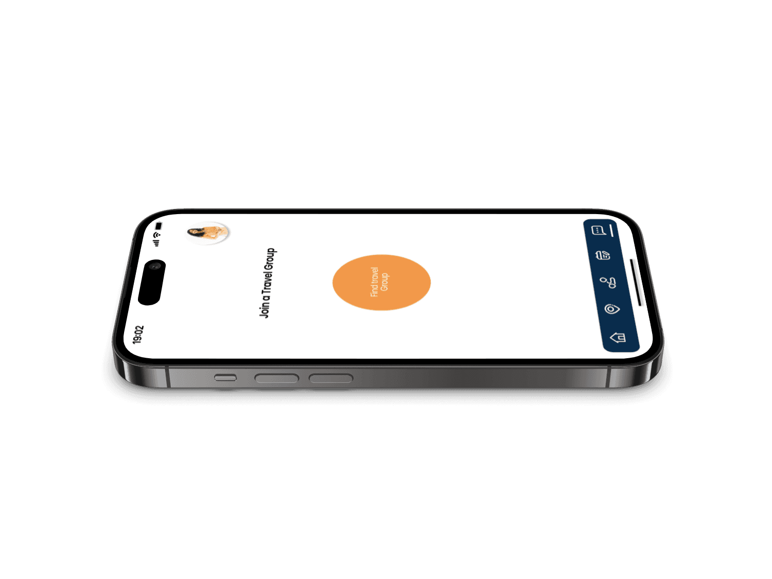
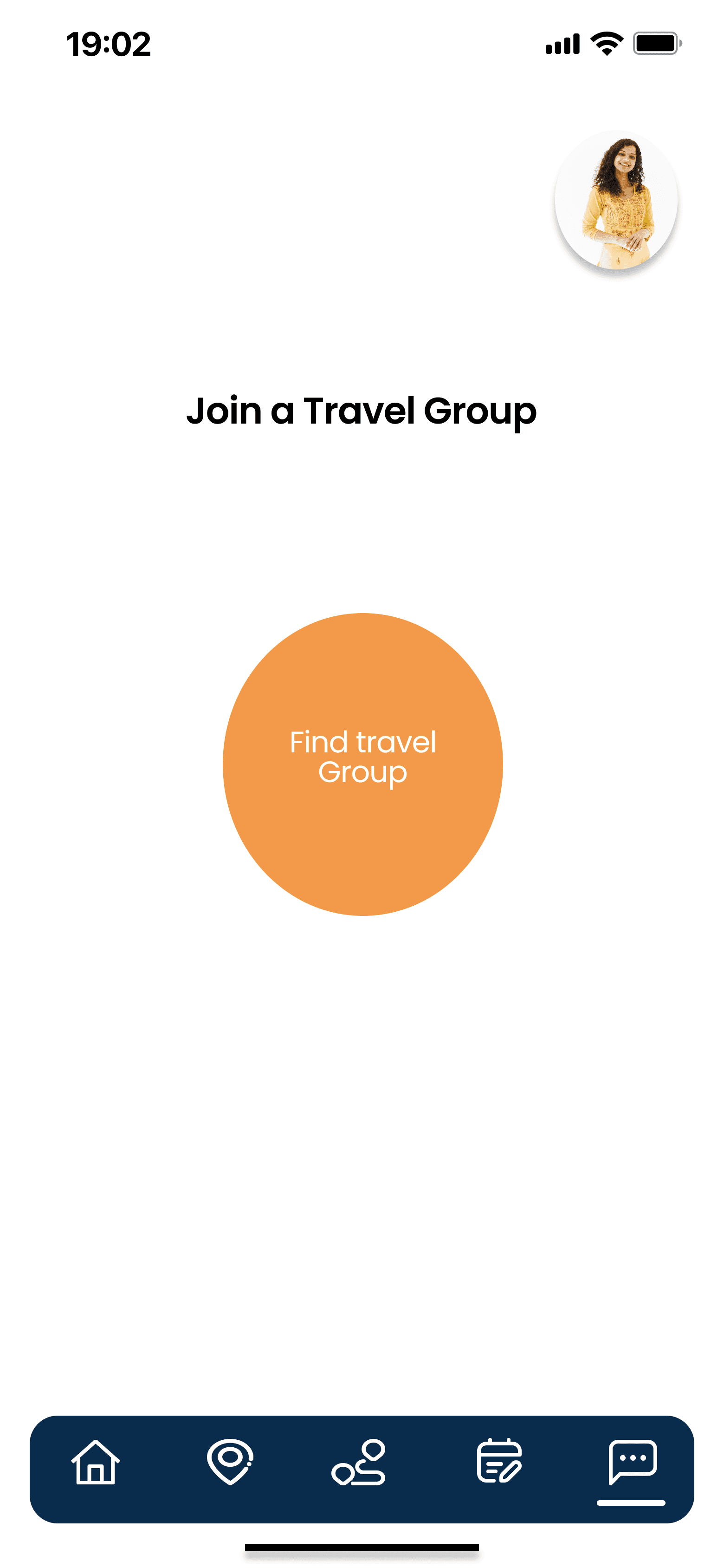
Chat Platform Screen
Chat Platform Screen helps solo travellers find a travelling partner. In the chat group, there is a moderator that verifies users before letting them enter the chat group. This helps users build trust among other users and build connections. They can even put out a message in the group asking for a trekkking buddy at a particular location
Swipe Gesture
Swipe Gesture is added to the payment section while the user is confirming their particular tour, flights and hotels.


Horizontal Scroll
This gesture is used at the navigation section shown on the screen. This navigation map offers the user look through the popular places near them.
Scroll Feature

Vertical Scroll
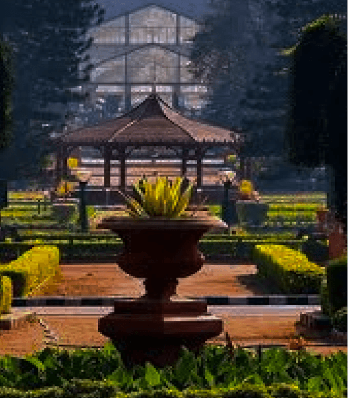
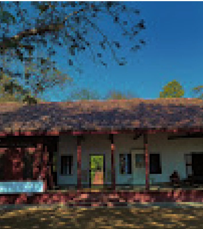
Moodboard
With the help of moodboards , I was able to visually communicate and explore the intended aesthetic, emotional tone, and design direction of a project. It served as an inspirational tool, helping me to work on the visual elements, brand identity, and user experience, ultimately guiding the creative process and ensuring consistency in the final design.


THANK YOU
Grateful for your time and attention!