Redesigning UTS app
UTS Indian Railways official mobile ticketing app to book unreserved train tickets
ROLE
UX Designer
CLIENT
Personal Project
PROJECT TYPE
App Redesign

What is UTS?
Why did I choose UTS?
The Unreserved Ticketing System (UTS) is an initiative by the Indian Railways to provide a quick and easy way for passengers to book unreserved tickets.
It allows passengers to book tickets at railway stations using automated ticket vending machines (ATVMs) or through mobile apps.
I chose to redesign it because UTS is a widely used app
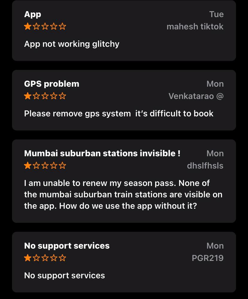
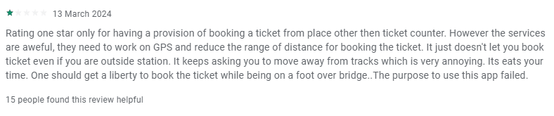
in Mumbai by the locals and through my research I was able to understand that a huge number of people find it hard to book a ticket on the app.
1
1
2
Looking through reviews on google, app store and play store, I was able to find these issues.
2

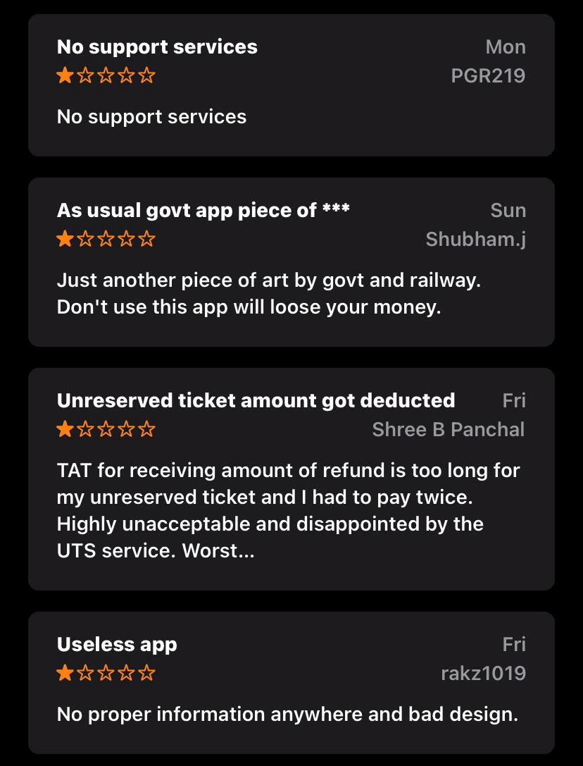
Key Insights
Users should be able to book a paperless ticket within the premises of
the station.
They should be able to renew their season passes more seamlessly.
Users want to be able to download their ticket after booking it.
They should provide updates on delayed trains and timings.
Providing the option to download the tickets after booking.
Being able to renew season passes easily.
Providing users with an easy way to rebook tickets to the same place where they have travelled
before.
Providing timely updates on any delays of the trains.
They will be able to book their ticket even from the premises of the station.

Possible Solution
I am used to with online services and I use booking apps.
Personality
Introvert
Thinker
Spender
Tech-savy
Meera Gupta, a 24-year-old
freelance writer and she regularly
travels by local train in Mumbai.
About

Bio
Meera Gupta is a 24-year-old freelance writer and blogger based in Mumbai, India. With a passion for exploring off-the-beaten-path destinations and immersing herself in diverse cultures, Meera frequently embarks on train journeys across India. She values authenticity, connection, and discovery in her travels, often documenting her experiences through captivating stories and vibrant photographs on her blog.
Core needs
Exploration: Meera seeks opportunities to discover hidden gems, scenic routes, and cultural experiences through train travel across India.
Community Engagement: She values connecting with fellow travelers, sharing insights, and exchanging recommendations through travel forums and user-generated content.
Inspiration: Meera desires sources of inspiration, such as curated lists, travel stories, and breathtaking photography, to fuel her wanderlust and inspire future adventures.
Planning Tools: She requires efficient planning tools within the app to create personalized itineraries, map out routes, and estimate budgets for her travels
Frustrations
Limited Connectivity: Meera faces challenges accessing real-time information and making bookings while in their inside the railway station.
Downloading Ticket: Meera is frustrated that she
is not able to download the ticket on her phone
after booking it.
Renew Season Ticket: She is not able to renew her season tickets easily. It is always a complex and time consuming process.
Brands


User Persona
I want to work on improving my stamina to run for a marathon.
Personality
Extrovert
Thinker
Spender
Tech-savy
Vikram Sharma is a 28 year old software
developer who uses the app to renew
their season passes frequently.
About

Bio
Vikram Sharma is a 28-year-old software engineer residing in Mumbai, India. Despite his demanding job, Vikram is passionate about exploring the diverse landscapes and cultures of India through train travel. Whether it's a weekend getaway or an extended backpacking trip, Vikram seeks adventure, excitement, and new experiences on his journeys across the country.
Core needs
As a busy professional, Vikram values efficiency and convenience in planning his trips. He requires streamlined booking processes, real-time information, and user-friendly interfaces to optimize his travel experiences.
Flexibility: Vikram appreciates flexibility in his travel plans, allowing him to adapt to changing schedules, spontaneous detours, and last-minute opportunities for exploration.
Being tech-savvy, Vikram relies on digital solutions for travel planning, navigation, and communication. He seeks innovative features and seamless integration with his devices to enhance his travel experiences.
Frustrations
Connectivity Issues: Connectivity issues can hinder Vikram's ability to access essential travel information, make online bookings, and stay connected with family and friends while on the go.
Limited Availability: Vikram often encounters challenges with limited availability and overcrowded trains, especially during peak travel seasons or festive periods.
He sometimes feels frustrated by uncomfortable seating arrangements, inadequate facilities, or long journeys without proper amenities.
Brands
Splash Screen
Yes
Yes
No
No
Login Screen
Create Account Page
Create Account
Dashbaord/Hompeage
Dashboard
Dashboard
User Flow
UI DESIGN
Background color
#F5F5F5
`
Primary Colour
#0F2D38
Primary Font Colour
#292929
Secondary Font Colour
#5C5C5C
Inactive Button Colour
#9C9C9C
Tertiary Colour
#9AC452
Colour Theory
Typography
Body Text 3
Semi-Bold/Regular
14px
14px
Body Text 4
Semi-Bold/Regular
12px
10px
Choosing a typeface and a color set were two of the most important things. So, I created a simple typography scale to ensure that hierarchy throughout the project is preserved. I created a simple UI Style Guide to maintain consistency.
Manrope
Iconography
Nutriflex
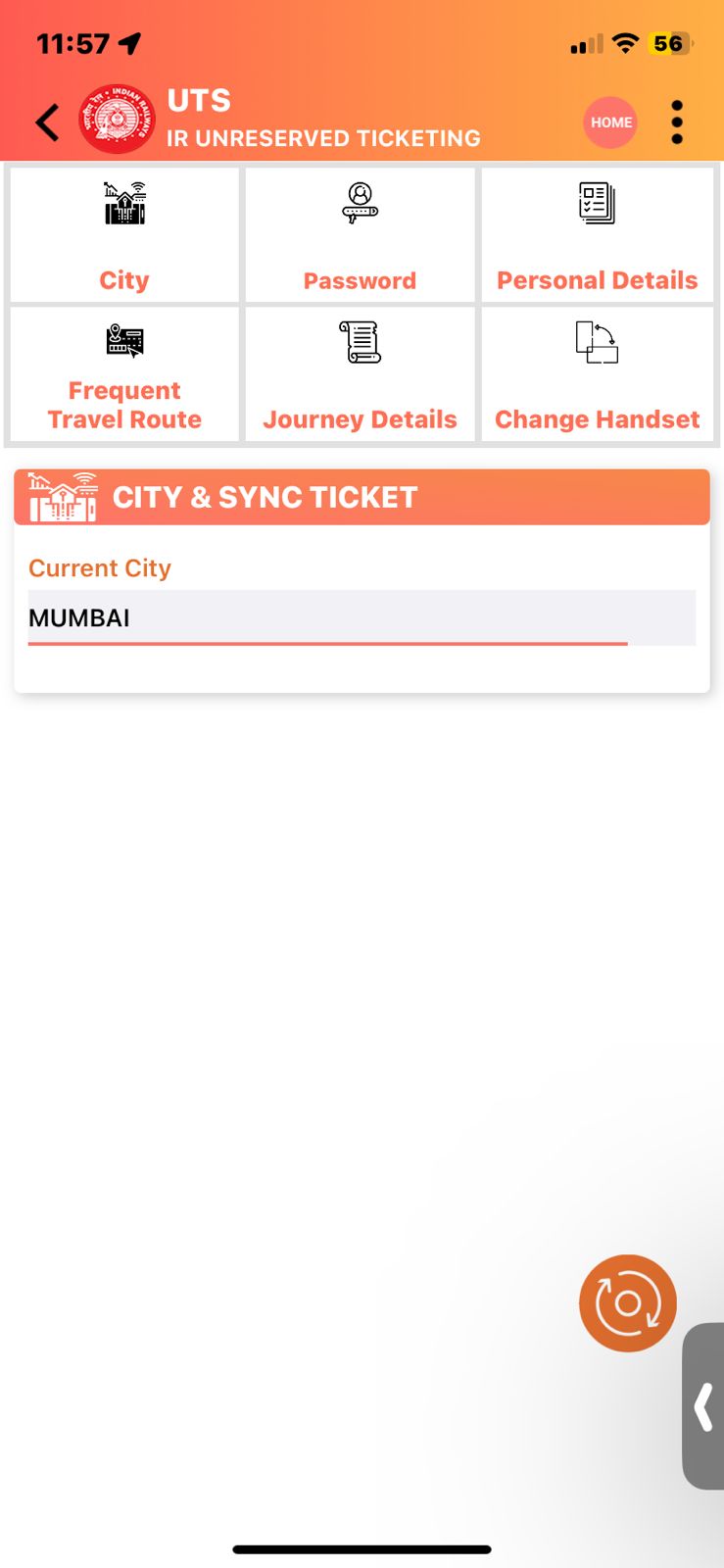
UTS
UTS
UTS
UTS
After several iterations, I came up with this icon. It shows what the app represents, fork i.e nutrition and dumbbell i.e exercise. A mix of red and yellow bring out a pop out of the colours and grabs the attention of the users.
New Design
In the old screen , there is no bottom navigation, users are habituated to navigating through pages using the navigation bar.

Good Evening Ryan
Mumbai
31°C
19:02
Search destination
Wallet
₹ 20.0
Add Money
Journey
Ticket
Quick
Booking
Platform
Ticket
Seasonal
Ticket
Commute Options Available
Travel Outstation
Book Consultation bus tickets
Earn ₹100 Cashback on every booking
Home
Wallet
Bookings
Profile
There are too many options from
which users have to choose from.
Centralizing an grouping features
to one section makes it easier for
users to choose from.
Old Screen
New Screen
Home Screen
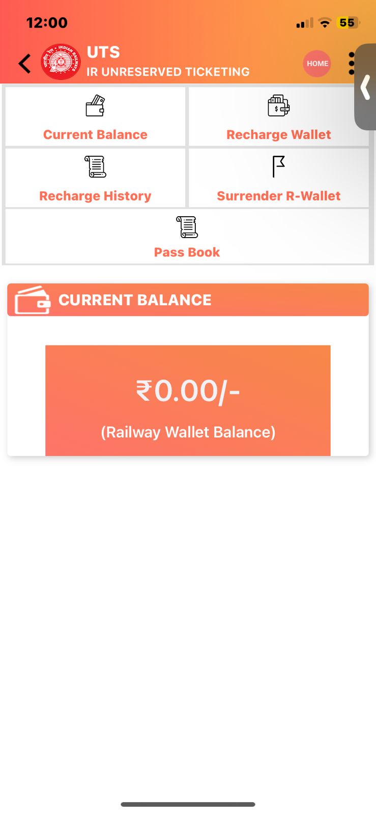
In the old wallet section, users are
confused as to where the CTA button is located.
They do not know which button to click on to add money on the wallet. In the new screen, the CTA is shown clearly.
The current balance section is shown twice which is unnecessary.
In the new screen, the user can easily see what their balance is.
Tummoc Money
Mumbai
31°C
19:02
Wallet
₹ 20.0
Add Money
Home
Wallet
Bookings
Profile
New Screen
Old Screen
Wallet Screen
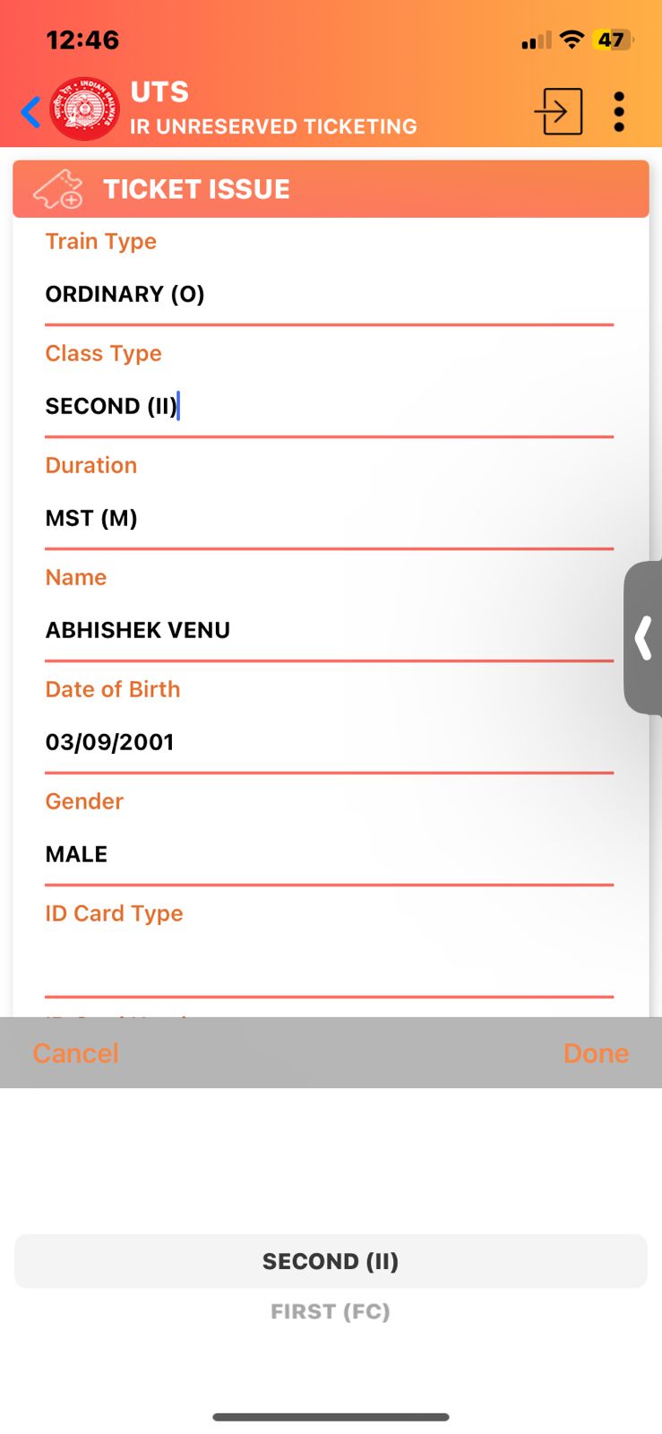
Season Ticket
Search by line
Name
Enter Name
Date of Birth
Enter Duration
Gender
Enter Gender
19:02
Train Type
Enter Train Type
Class Type
Enter Class Type
Class Type
Enter Class Type
ID Card Type
Enter ID Card Type
Duration
Enter Duration
ID Card Number
Enter Card Number
Payment Type
Payment Type
Address
Enter Address
SUBMIT
Second Class
First Class
Under the season ticket section, the old screen does not show dropdown menu arrow. So, this gets confusing for users.
In the new screen, I added the arrow icon for users to know that it is clickable.
New Ticket
Old Ticket
Season Ticket
Profile Section
Edit Profile
19:02
First Name
Email ID
Phone Number
Gender
Gender
Date of Birth
Last Name
Enter Name
Please enter email
Please enter date of birth
Enter Name
Enter Number
+91
Male
Female
Others
Save
Home
Wallet
Bookings
Profile
The profile section looks very different from other apps, which would be time consuming for users to fill their details.
So, I added a profile section similar to other apps, easy to fill and simple.
New Screen
Old Screen
Booking Section
From my research and going through user reviews, I was able to understand that users want to download their tickets after booking it.
I have given a colour to the Re-book ticket button and cancel ticket as well. Whereas in the old screen, the CTA’s don’t stand out.
Booking Details
Mumbai
31°C
19:02
From
Mulund
To
Thane
Date
March 05,, 2024
Class
Second
Re-book Ticket
Cancel Ticket
Home
Wallet
Bookings
Profile
From
Mulund
To
Panvel
Date
March 05,, 2024
Duration
Monthly
Class
Second
Re-book Ticket
Season Ticket (Ordinary Ticket)
Journey Ticket (Ordinary Ticket)

New Screen
Old Screen
Final Details and Payment Screen
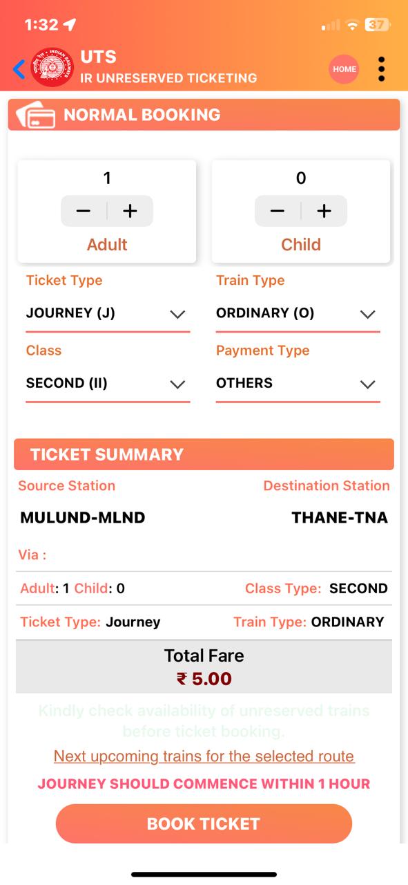
Mulund Railway Station
CSMT/CST Railway Station
.
.
.
19:02
Total Fare
₹20.00
JOURNEY SHOULD COMMENCE WITHIN 1 HOUR
BOOK TICKET
Passenger Details
Adult
Child
Ticket Summary
Ticket Type
Class
Train Type
Payment Type
Paytm UPI
Google Pay
+
Add New Payment Method
New Screen
Old Screen
In the new screen, I have added a dropdown menu section which helps user to click on the button
to open the details.
Users are used to reading the information vertically so this new design will not make users confused.
Results and Conclusion
I gave out the new designed app for testing to users and I was able to make some minor changes to the final iterations.
A few things I would incorporate in the future are, a safety feature for women so that they can travel safely.
I would add a chat platform for users to clear out their queries and also
for emergency situations in case of trouble.

UI DESIGN
Aa
Body Text 3
Semi-Bold/Regular
14px
Body Text 4
Semi-Bold/Regular
12px
Name
Font Weight
Font Size
Heading 2
Bold
42px
52.8px
Heading 3
Bold
34px
44px
Heading 4
Bold
30px
35.2px
Heading 5
Semi-Bold/Regular
24px
26.4px
Body Text 1
Semi-Bold/Regular
18px
22px
Body Text 2
Semi-Bold/Regular
16px
18px

THANK YOU
Grateful for your time and attention!